The Loudest Pixel Wins: How UK Casino Lobbies Arrange Your Attention
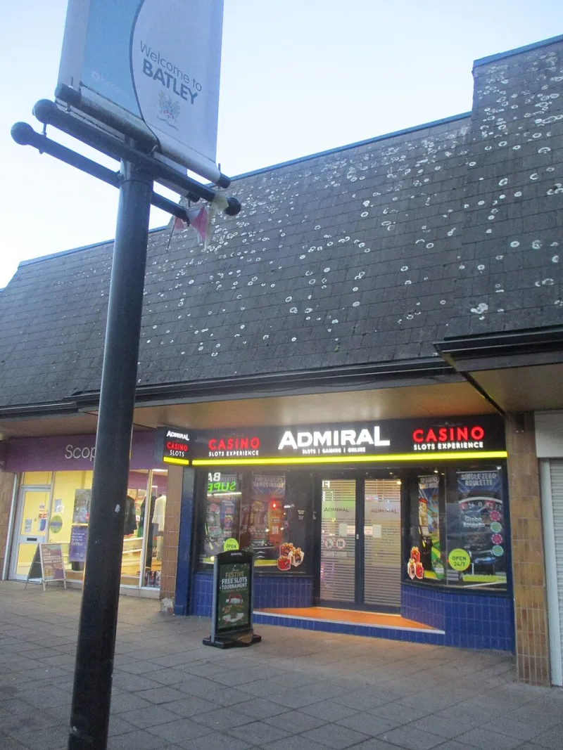
Photo: Mtaylor848, CC BY-SA 4.0, via Wikimedia Commons
Before you read a single term, a UK casino lobby has already made an argument. It has decided what should be biggest, brightest and most likely to move. That is not automatically sinister — every shopfront arranges its window — but it is worth noticing. A site’s type sizes and colour choices are part of its editorial voice. They tell you what it wants you to see first, and what it hopes you will find later, if at all.
This is not a hunt for villains. It is a visual audit you can run in a few minutes, in the same spirit as reading a paytable before spinning. You are checking the hierarchy. You are asking whether the important stuff — wagering terms, withdrawal limits, safer-play tools — sits in proportion to the jackpot banners and bonus buttons. If the answer is no, that is useful information before you deposit a penny.
Start with the squint test
Open a casino homepage on your phone or laptop. Do not click anything. Squint slightly, or blur your eyes for a second. What survives? Usually it is a headline, a colour block, a button, maybe a countdown. That is the lobby’s priority list, whether or not anyone wrote it down.
Now run the same test for the things you actually need. Where is the deposit-limit page? The time-out tool? The full bonus terms? The withdrawal section? If you have to hunt through a footer, a hamburger menu and a help centre, note that. Not every useful link can be the biggest thing on screen. But there is a difference between quiet and concealed.
Size is a hierarchy, not a verdict
A casino has to sell its games. A big jackpot figure, a bright ‘Deposit’ button and a smiling welcome offer are commercial furniture. The question is proportionality. If the bonus headline is 72 pixels tall and the wagering requirement is a grey line under a fold, the design is making a choice about your attention.
Look for the gap between promise and condition. A ‘£500 bonus’ in huge type may be followed by ‘40x wagering on selected games’ in body text. A ‘daily jackpot’ banner may not mention that the prize is shared, capped or tied to a particular game. None of that makes the offer fake. It makes the design persuasive. Your job is to read the persuasive layer and the contractual layer as one document.
Colour contrast and the vanishing small print
Small print is not always a warning sign. Terms have to live somewhere. But contrast matters. Light grey text on a white background, or pale yellow on cream, is harder to read than it needs to be. On a mobile screen, in a kitchen with the kettle boiling, it may as well be invisible.
Try this: screenshot the bonus box, then zoom in. Can you read the eligibility rules without pinching and squinting? Can you find the link to full terms with your thumb? If the key limits — maximum withdrawal, game weighting, expiry date — are only visible in a low-contrast footnote, treat that as a design choice. You do not have to be angry about it. You just have to account for it.
Motion borrows attention
Animation is the lobby’s tap on the shoulder. A spinning coin, a scrolling winner ticker, a countdown that never quite reaches zero — these are not neutral decoration. They create urgency and keep your eye moving. Some sites let you reduce motion in settings or via your device. If they do, use it. If they do not, notice how much of the page is asking to be watched rather than read.
A useful test is to ask what the motion is telling you. Is it showing a game feature? Confirming a deposit? Or is it simply making the page feel busy so that leaving feels like missing out? Busyness is not the same as information.
Read the lobby like a paytable
A paytable tells you what symbols pay, what triggers a feature and what the rules are. A lobby tells you what the site values. Read it the same way. Identify the headline promise, then find the conditions attached to it. Identify the most prominent action, then find the controls that let you stop or slow down. If the controls are present and findable, that is a good sign. If they are technically there but visually apologetic, adjust your expectations accordingly.
A good UK casino does not have to make safer gambling the loudest thing on the page. It does have to make it reachable without a treasure hunt. Deposit limits, time-outs and account closures should be easy to locate, and the language should be plain. ‘Take a break’ is clearer than ‘self-exclusion management interface’. Design can be commercial and still be honest.
A seven-point type-size audit
- The biggest word: What is the largest text on the homepage? A jackpot, a bonus, a game title or a warning? Note it without judging it yet.
- The distance to safer play: How many clicks from the lobby to deposit limits or a time-out? Try it on mobile.
- The bonus condition: Can you find wagering, max win and expiry without leaving the offer box?
- The withdrawal line: Is the withdrawal time or limit mentioned near the deposit button, or only in a help article?
- The contrast check: Screenshot the small print and zoom. Is it readable?
- The motion switch: Can you reduce animation? Does the page calm down if you do?
- The search field: Type ‘withdrawal’, ‘limit’ and ‘safer gambling’. Are the results clear and direct?
None of these checks is a pass-or-fail exam. They are notes. A site can have a loud jackpot banner and a well-signposted safer-play menu. Another can have tasteful typography and terms that are still a maze. The audit is there to stop you confusing polish with fairness.
What the 777 in the logo actually means
The sevens are branding. They are not a probability, a promise or a personality. The numbers that matter are the ones in the terms: wagering, maximum win, withdrawal time, deposit limit, net spend. A lobby can put a giant ‘777’ on the screen and still be a perfectly ordinary slot site. The font size does not change the maths.
So before you sign up in 2026, spend seven minutes reading the page as a piece of design. Ask what it is shouting and what it is whispering. If the shouting is all promise and the whispering is all condition, believe the whisper. Your attention is finite. A good casino lobby should respect that, or at least not pretend otherwise.